From concept to delivery
The Oxford Hills Music and Performing Arts Association produced Man of La Mancha in November 2008. The show's producers asked for a poster "with people and a windmill." We scheduled a photo shoot with the principal actors and set to work.
For OHMPAA projects, I like to use a standard font for "institutional" copy (name, dates, ticket information) and then choose an appropriate display font for the show title and playwright. Sometimes the display font is readable at small sizes so I can use it on more of the poster, which is what happened this time. I chose Mikadan because it looked vaguely old and European, and had some interesting swash caps.
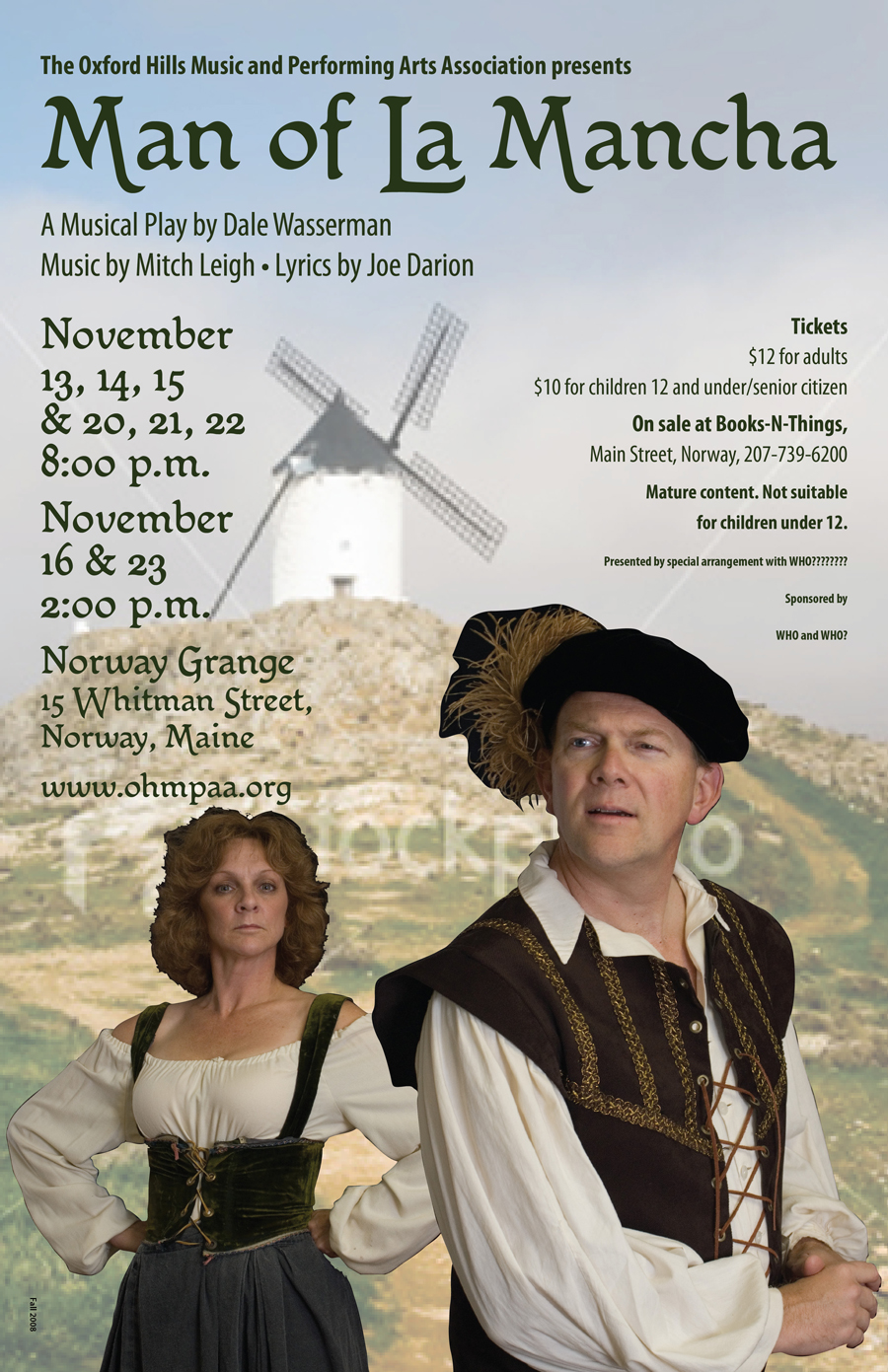


The producers wanted a real windmill in the background, so I hunted through iStock and comped a design for them to look at. Full color was too busy, so we tried sepia. Not right either. I got less literal and tried just the windmill vanes as more of an abstract idea, but it turned out to be too abstract.
I liked the vane idea though, so I married that background to the actors. I thought it would be cool to do two different posters, one with Don Quixote and one with Dulcinea, maybe varying the background colors as well. We weren't quite there yet, and the producers preferred a single poster with both actors. So I went back to the original pair of photos, refined the vane background, desaturated the actors and came up with the final version below. It is still one of my favorites.
The final Man of La Mancha poster. Everything came together at the end.